UI-Design – Spacing
Use whitespace
Use whitespace to
- separate without cluttering
- highlight focal points
External spacing > internal spacing > logical groups!
(Check the bounding boxes.)
Double your whitespace.
Spacing within body text
always depends on the font
- space between paragraphs
- space between lines/within a paragraph
- space between characters
1. space between paragraphs
fail left: no paragraph spacing (p.s. is too less)
fail right: double line break (is too much)
in between zero and the full line height
2. space between lines
fail left: zero (is too less)
fail right: space between paragraphs (is too much)
this is actually the line height, which depends totally on the line:
- on the font, bc. different fonts have different line-heights built in
- on the length of the line (reading flow)
3. space between characters
this space is built in, okay for body text, for UPPERCASE add some letter spacing
Font-size and line-length
Font-size and real data is like chicken and egg. Don't fully commit to one as long as you don't know both.
The CPL
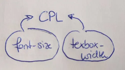
cpl ... characters per line
The cpl, the font-size and the line-length feed back into itself. Font and font-size affect the line-length, the longer the line, the more line-spacing is needed.
Less cpl, less line-height needed (expecially for headlines)
fail left: zero space (too less)
fail right: so much space that you can fill in a whole new line